People have always looked towards the stars, seeking inspiration, beauty or simply a few moments of peace and quiet. It would seem that this behavior has made its way into the automotive world, where it has become one of the most popular symbols for visual identities of different car brands.
Some may remember the times when people sailed across the oceans around the world, while using the stars as navigation instruments, our natural GPS system (feel free to look up sextants).
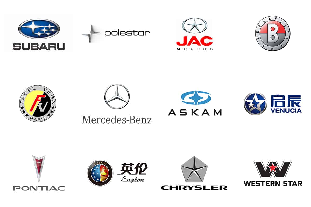
Nowadays, stars have become a symbol of power and precision because they go hand in hand with glory and success. There are quite a few automobile manufacturers around the world which use stars for their logos, for more than one reason.
As such, we decided to have a closer look at the most famous ones and their vision and meaning behind the decision. Can you guess what names come up next?
Mercedes-Benz
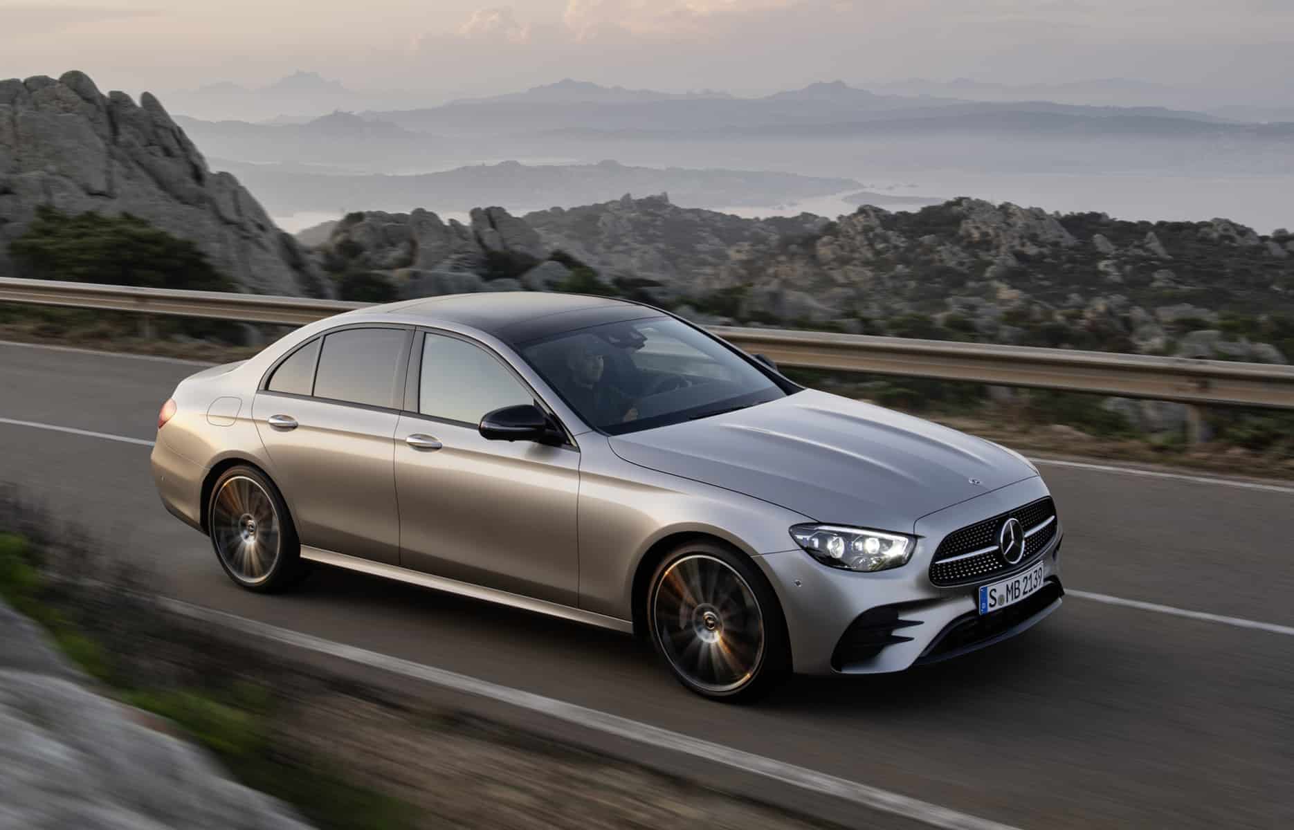
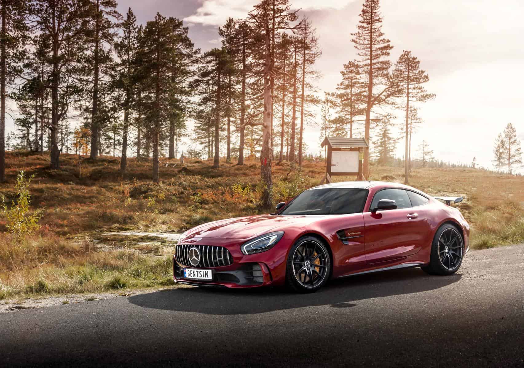
Who could forget about the Germans and their passion for cars and skills for engineering marvels? The most obvious of icons that come to mind, this famous star-shaped car badge is what Mercedes-Benz has been displaying for years. The elegant three-pointed star is associated with luxury, comfort, speed and German quality and engineering. There are quite a few Mercedes models that took the world by storm, including racing cars – anyone else thinking about the F1 division?
It all started in 1909, when the company made the decision to pick this logo. Why three rays? Well, the engines developed by Gottlieb Daimler for anything people could think of, be it a ship, airplane or car. Although it seems inspired by those three different fields, the star has its origin in the founder of the first steam engine, Carl Benz, and the fact that he was the one who registered his trademark, the steering wheel, in 1903.
By 1926, a laurel wreath and a three-beam star came together to create the logo we know so well today.
Subaru
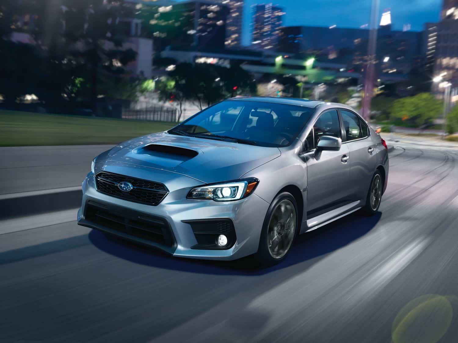
The Japanese company that became popular mostly due to WRC events and multiple championship wins and the high-performance vehicles it launched, also features a star badge. The Subaru logo displays a blue oval incased within a chromed shape, enclosing a galaxy of six four-pointed stars.
Just in case you were not aware by now, ‘Subaru’ is the Japanese name of the M45 cluster, found in the Taurus constellation. Did you know that 6 companies merged only to result Subaru?
There is a larger star on the left, hinting towards Fuji Heavy Industries, and the five smaller stars represent its subsidiaries, with Subaru raising the bar for automobile divisions everywhere.
The Subaru name is and most likely forever will be associated with the Impreza model – that unique and performance-oriented car that has taken the world by storm 30 years ago. However, there is a very long list of interesting cars bearing the same name and logo.
Chrysler
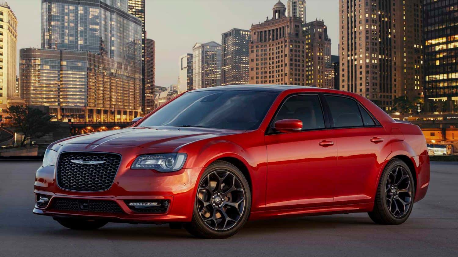
The Americans at Chrysler have been known to reveal some interesting models over the years, and their star emblem has become iconic – although it was ditched in favor of a more traditional auto industry symbol — wings.
The “Pentastar” has vanished once the Fiat Chrysler Automobiles Group (FCA) group has been formed, and the updated emblem looks somewhat unfamiliar. Most fans of the brand are quite impressed by the vehicles released prior to this merger – feel free to look up some cool and interesting Chrysler vehicles. There is no shortage!
Introduced in 1962 and designed by Robert Stanley, the soon-to-be famous logo was handpicked from a pile of seven hundred suggestions. Some say the five ends of the star represented Chrysler’s five brands, specifically the Dodge, Airtemp, Chrysler, Plymouth, and Imperial cars we all love and appreciate. Could it be true?
Western Star
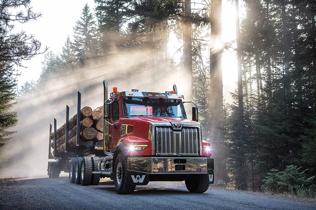
Based in Portland, Oregon, Western Star Trucks is actually subsidiary of Daimler Trucks North America. Although corporate changes resulted in the company changing a few owners over the years, clients have always relied on the company’s products and the quality involved with each build.
By 2000, Western Star was purchased by Daimler Chrysler, becoming part of the Freightliner Trucks division. To this day, the company is still alive and keeping busy, building a series of truck models that work hard each and every day.
This American brand has its logo displaying a capital “W” and a five-pointed star. This truck manufacturer decided a graphical reflection of its name should feature the blue, red, and silver color palette reveal their focus on patriotism and reliability.
Pontiac
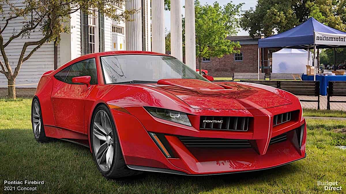
What is this name famous for? At least, what comes to mind whenever you heard of it? To me, it’s that outrageous Trans Am with The Bandit behind the wheels that gets me every time.
Pontiac was a brand of automobiles manufactured and sold by General Motors. Sure, there are quite a few other cars from Pontiac that deserve a place on a cool list, but that particular one always seems to get ahead.
Nonetheless, the company’s emblem was designed in the form of an Indian headdress; however, by 1957 it was already updated and featured the red arrow, located on the splitting of the grille.
Although Pontiac ceased production in 2010, that logo still goes around in our minds, almost like yelling ‘Breaker, breaker!’. Those of you young during the 1980s will, most likely, be atrial to that dark and Shiny KITT car.
Polestar
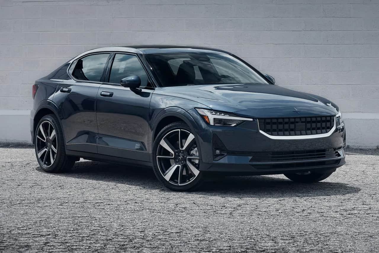
Volvo fans might already be familiar with this one, although you are not required to love Volvo cars before loving the thrills a sports car delivers. Polestar, as you might have guessed by now, is a subsidiary brand of Volvo and it focuses on the development of sports road cars.
The brand started off as a sports racing organization Polestar Racing, and its logo reflects its name while a very minimalist and stylized image completes the overall look. A four-pointed Star displays two elements resembling a boomerang, which are connected by their rounded angles.
It is up to you to decide, but it seems that the people over at Citroen consider that the Polestar logo is way too similar to their cool DS division – so much so, that the French automaker has banned the sale of Polestar electric cars in France.
JAC Motors
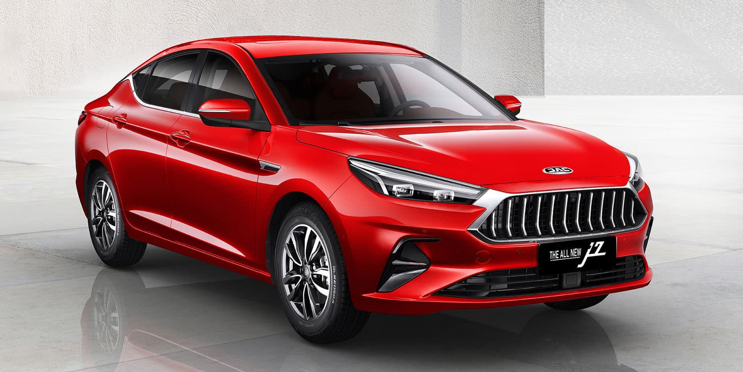
Established in 1964 as Hefei Jianghuai Automobile Factory, Chinese automaker JAC has historically only produced commercial trucks under the brand name Jianghu, but MPVs and SUVs appeared in the 2000s.
By 2007, the company was revealing passenger cars although their reputation proceeds them and everyone thinking JAC is thinking trucks. Their logo looks somewhat to Chrysler’s, meaning that an elegant five-pointed Star with thin sharp beams is on display, while a fine oval frame completes the design. Nowadays, the manufacturer makes use of a text-based badge, minimalist and modern.
So modern that by 2010, JAC announced a focus on passenger cars, as well as a new electric vehicle program. Everything took a serious turn in 2017, when JAC Motors and Volkswagen Group announced a joint venture to produce electric cars for the Chinese market with the SEAT brand.
Venucia
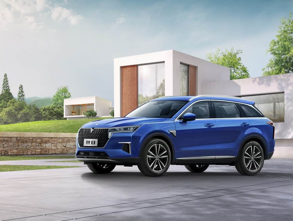
Launched in September 2010 by Dongfeng Nissan, Venucia is a marque focused on selling vehicles developed and designed by the company in China specifically for the local market. Did you know that the Venucia name means “Beginning of a new day”?
The “Venucia” name was inspired by the ancient Roman goddess Venus, which was known for prosperity and beauty. The company made five promises – respect for customers, creating value, always doing the best, achieving world-class quality, and following the dream – hence the five stars used by the brand logo.
The brand’s line-up is constantly evolving and getting bigger, thus making sure customers will look their way and possibly trade in their older cars for a Venucia model.
Englon
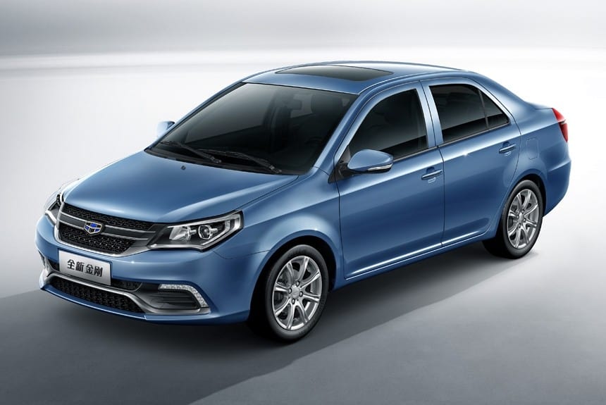
Established in 2010 with the purpose of replacing the Shanghai Maple brand, Englon is a Chinese brand that aims to replicate the classic British style. Their vehicles are quite popular on the Chinese market, especially since Geely managed to acquired The London Taxi Company a few years ago.
This was an important moment in British history, and people were all going crazy about it. Nonetheless, the Englon emblem became the new logo of The London Taxi Company, six silver five-pointed stars sitting above a blue background in the left part of a bright and elegant circular emblem.
Englon models – SC3, SC5, SC6 (you get the idea) – feature various modern equipment, aiming to provide you with an extra option; I will admit some of the company’s portfolio have made my eyebrows move. Don’t go asking us about deliveries and taxes; you are on your own.
Askam
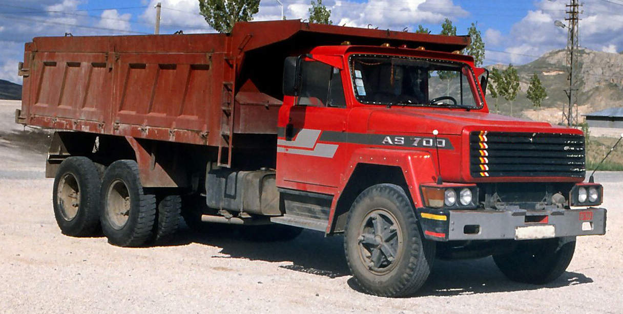
Askam, a subsidiary of Çiftçiler Holding, was a manufacturer of trucks and commercial vehicles in Turkey. After declaring bankruptcy, the company disappeared by the end of 2015. However, not all that many people knew about its existence – I am willing to bet this is news to you.
Founded in 1962 as joint venture with 60% ownership by Chrysler, the company started developing trucks in 1964 under the Fargo, Desoto, and Dodge brand names. Most of the models built utilized a cab and front end developed by Chrysler specifically for manufacture in developing countries.
Before ceasing operations, the Turkish automaker was known for a very masculine logo, displaying a black and silver color palette while a bold four-pointed Star was set in the middle of a black horizontal oval.
Aside from that, the company did manage to reach quite a few markets and countries, due to heavy exports that kept it alive for as long as it did.
Facel Vega
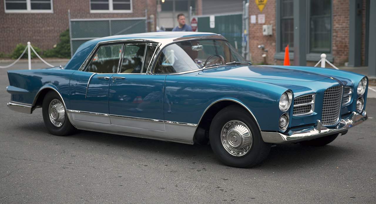
Although short-lived, this company is still worth mentioning. To intensify its World War II war efforts, the French subcontracting company for military aeronautics Bronzavia created a subsidiary called Facel (acronym of Forges et Ateliers de Constructions d’Eure-et-Loir) in December 1939.
This historical French auto brand started off as a manufacturer of steel fittings and stamped steel components. By 1945, it joined forces with the Métallon company and Facel began developing cars based on vehicles developed by other companies, including Simca, Ford, and more.
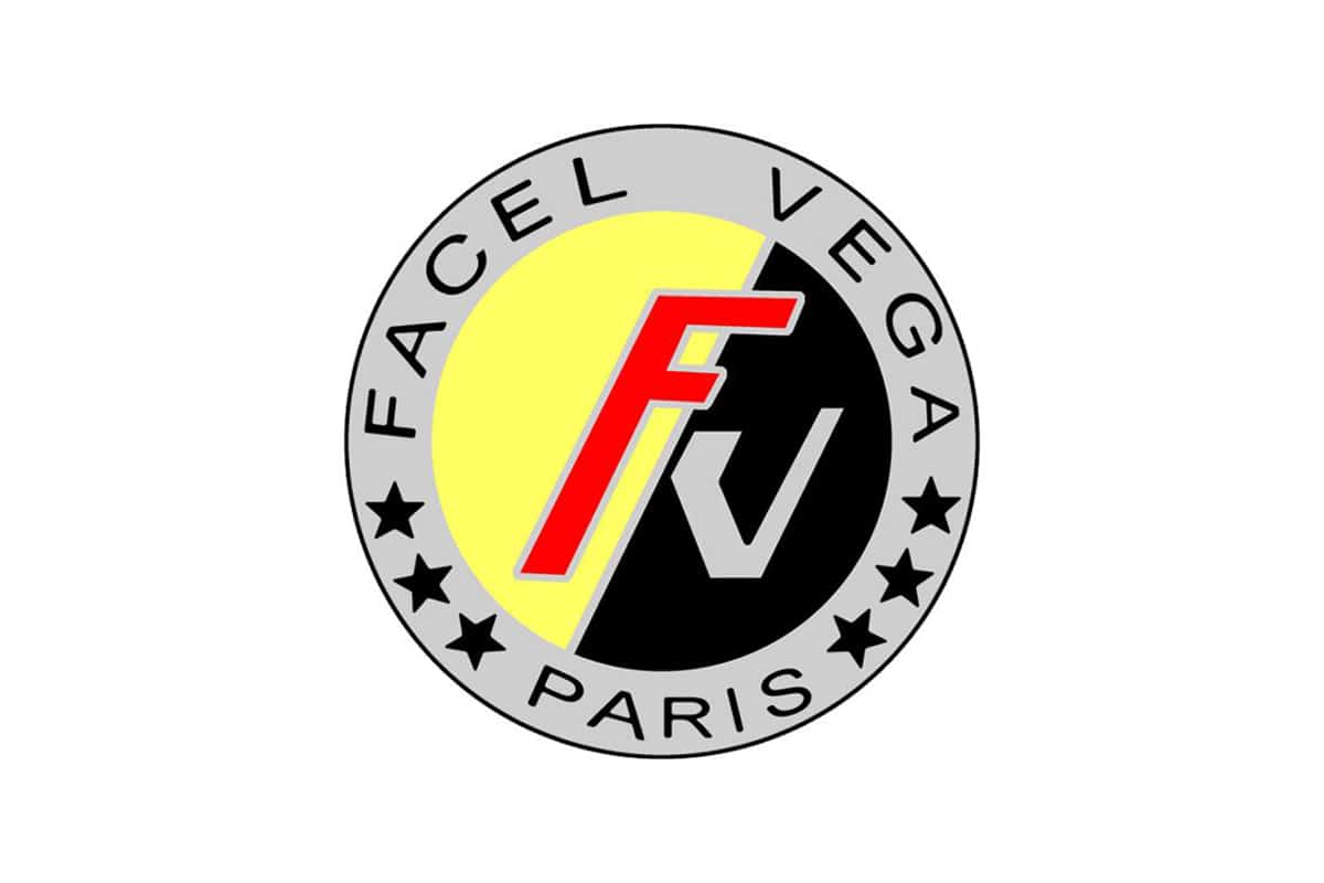
The company’s car logo includes six stars in a round which surrounds a red F letter and a silver V letter, in which three are in the left lower half and three are in the right lower half – placed on a thick silver frame, with the brand’s name showing off black sans-serif letters.
Sadly, by 1964, this company was only a name in automotive history. Luckily, there are still plenty of French automotive companies that kept these efforts going – care to name a few of those companies?
Berkeley
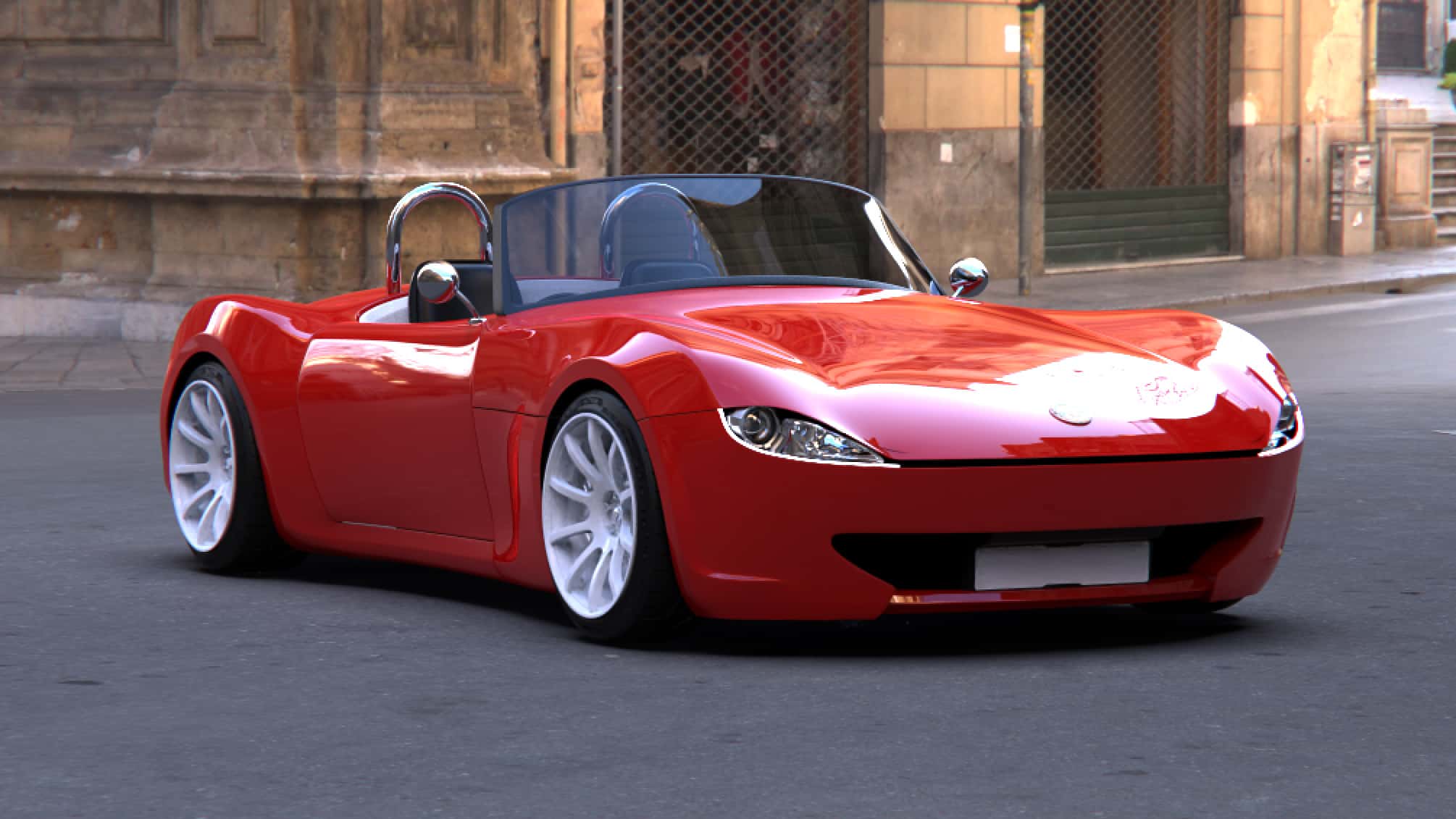
Berkeley, a historical British automaker, will have made history by 1960 when operations stopped. Established in 9113, the company was focused on microcars and motorcycle engines.
Based in Biggleswade, Bedfordshire, England, Berkeley Cars Ltd developed economical vehicles built around motorcycle-derived engines from 322 cc to 692 cc. Designer Lawrence “Lawrie” Bond joined forces with the Berkeley Coachworks factory owned by Charles Panter – one of the largest manufacturers of caravans in Europe.
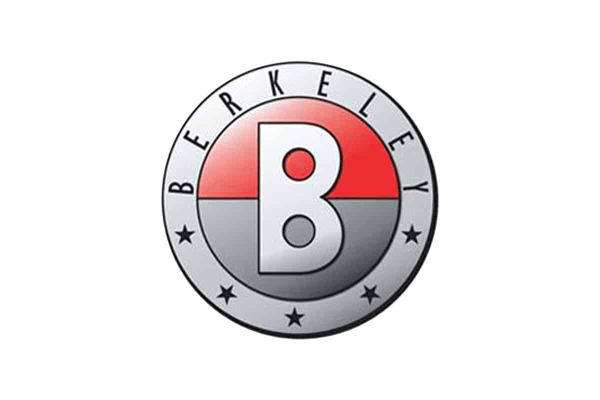
The Berkeley logo had a circular badge in white and red display a stylized letter “B” right in the middle; a golden frame encloses everything – including five small stars arched on the bottom.
The early cars were an immediate success, although they also earned a reputation for fun, if fragile, sports motoring on a budget. There are a few hundred cars known to survive worldwide.
Conclusion
We will keep searching for new and interesting star-inspired car logos. There are plenty of hidden gems throughout automotive history and recordings, there is no doubt about that. However, it might take some time – as such, your input and questions are welcomed, in the comment section below.
In the meantime, keep an eye out for new and interesting car-related articles. Speaking of input – do you have any ideas about what topic we should cover next? Let us know, we’ll take it under advisement.

