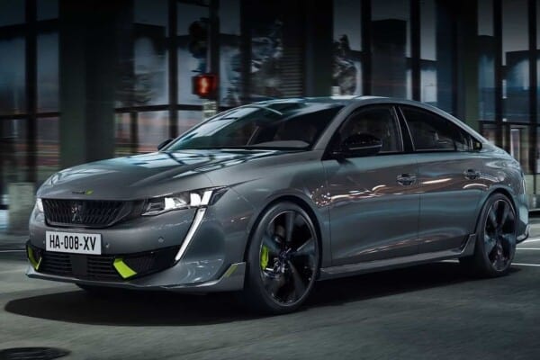
Our dreams of flight and freedom have been inspired by the beauty and elegance of Mother Nature. Birds and bird symbols have long had powerful meaning and an important part of every civilization’s values and evolution.
Freedom. Independence. Agility. Speed. These are the attributes that instantly come to mind while you sit atop a cliff, looking down at the world whilst admiring a wild bird harnessing the power of the wind.
As such, it should not come as a surprise that automotive companies have felt equally inspired while deciding upon a brand logo, with some big car companies that did just that worth mentioning.
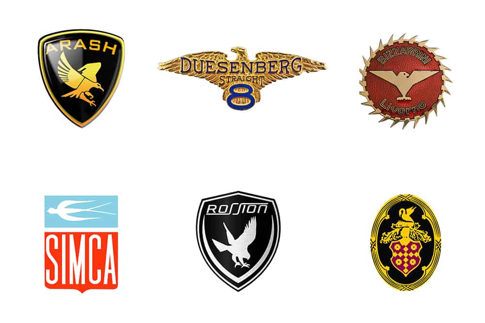
Whether it’s a falcon, an eagle, or an otherwise majestic bird of prey, car logos inspired by birds usually look wonderful and inspiring while adorning a vehicle’s hood. Meant to convey confidence and power, the bird is also associated with good luck and bliss.
In some cultures, birds are considered messengers from the spiritual realms, but that seems like an inappropriate reason and symbolism to associate with a newly introduced vehicle model. So, before we go any further, we ask you: how many car brands do you know of that have a bird logo?
Duesenberg
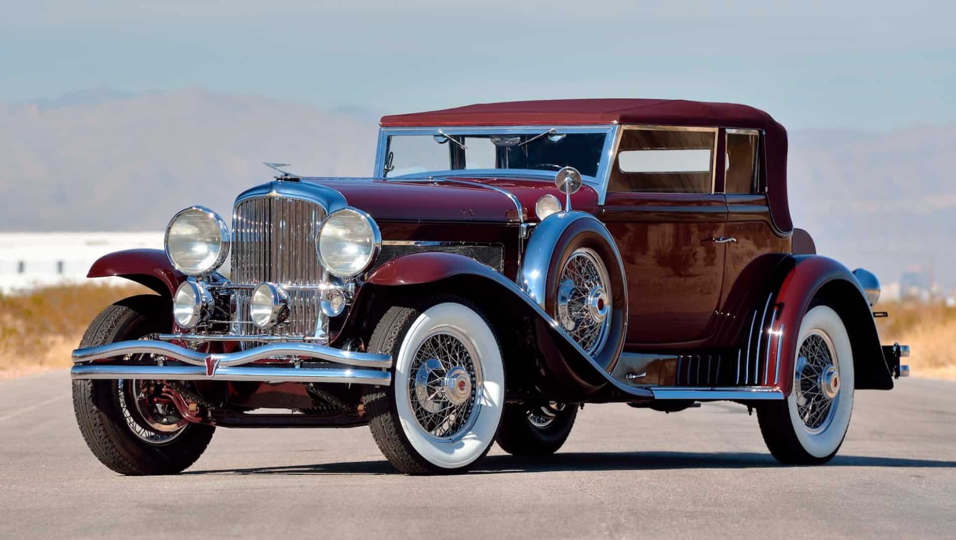
The iconic American car brand was established way back in 1913, with most of their research and development back then focused around delivering high-performance cars. The original company has been defunct for years, but that doesn’t mean it’s been forgotten. Nowadays, Duesenberg vehicles are highly collectible and a rare automotive item to be driving around town.
Duesenberg Motors Company went through significant effort to manufacture racing cars and high-end luxury automobiles for that period. The Minnesota-based company built its own engines and vehicles, and it became renowned around the world, but a few years after the Great Depression everything was on hold – indefinitely.
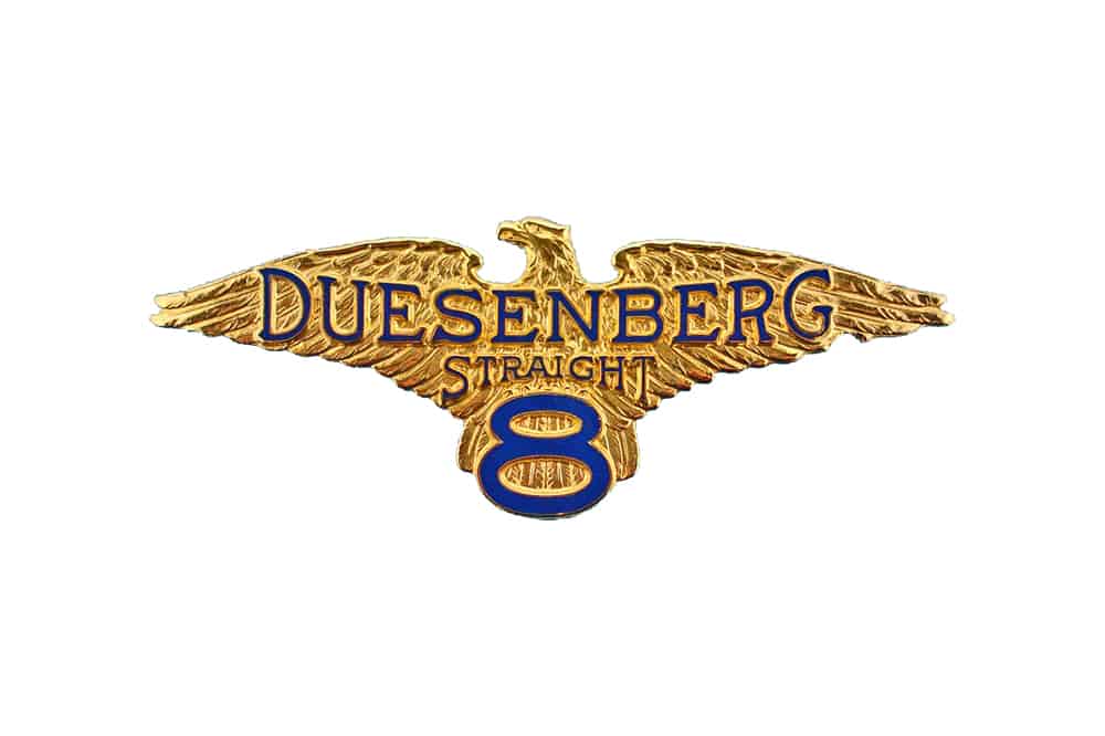
The company logo, as stylish and beautiful as it looks, was used for much of the company’s history. There have been other designs, as well, but the eagle emblem remains a fan favorite and representative for the brand.
Timeless, as the name and the company’s legacy, a beautiful golden eagle with outspread wings complements the manufacturer’s name written in dark blue coloring on their logo. The detailed eagle was most likely chosen to inspire power, speed and possibly domination over other automotive brands – something that the brand did achieve, on a global scale we might add.
Packard
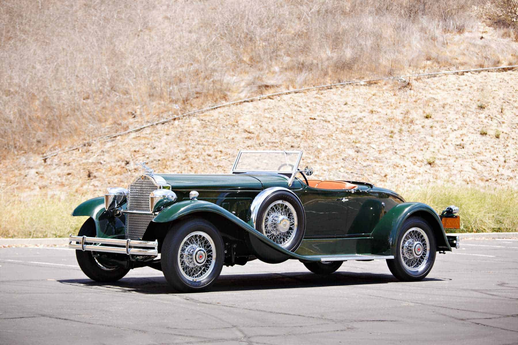
Another defunct American-made car manufacturer, Packard was also dedicated to creating and selling luxurious automobile designs.
Based in Detroit, Michigan, the Packard Motor Car Company was developing vehicles as early as 1899, with the last one rolling out the factory gates sometime in 1956 – the Predictor concept car was their last ever design.
In between, one of the big American car companies of the era, Packard did develop quite a few high quality passenger vehicles, which have made the brand’s logo a powerful statement: the figure of a graceful swan with raised wings.
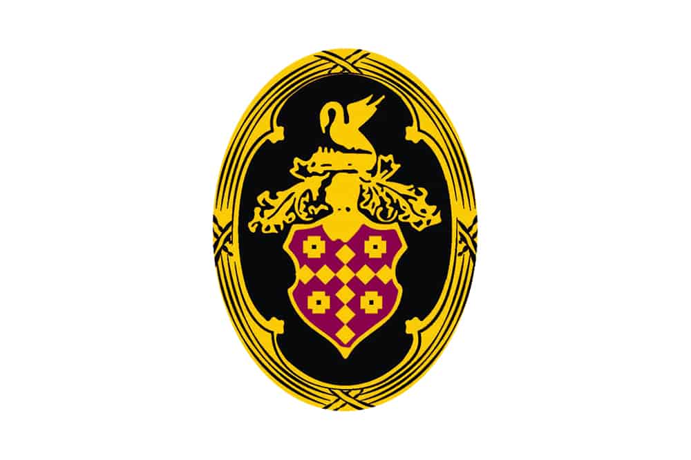
The elegant and graceful nature of the swan seems to be a fitting choice for an automotive brand focused on luxurious designs. Even in today’s dynamic market, this decision will most likely hint towards a manufacturer of expensive and exclusive vehicles.
The emblem of choice made use of a shield, with red clothing and golden ornaments, A wordmark, featuring the company’s name, hand-written in italic letters were arranged diagonally – colored red, in order to match the shield.
Bizzarrini
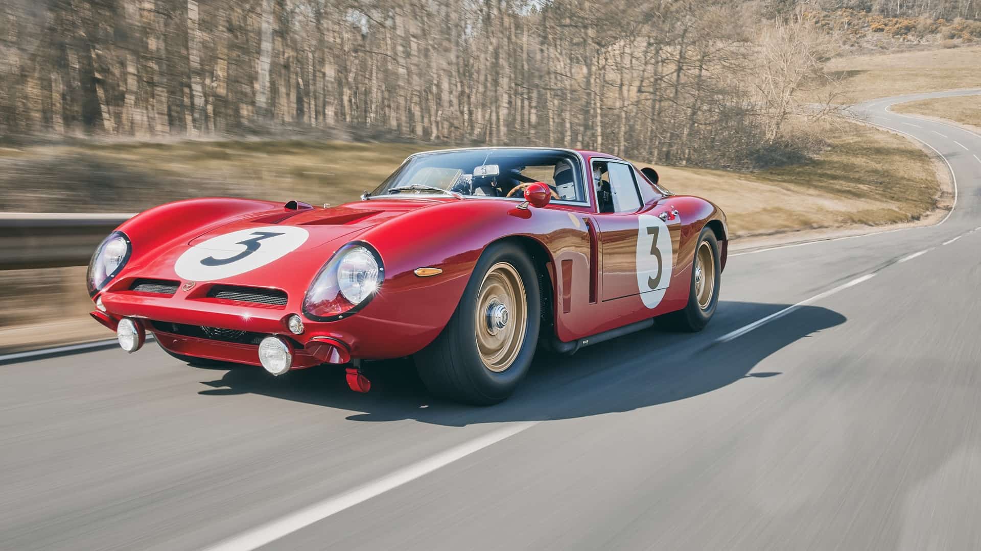
The house of Bizzarrini is one of the most interesting Italian carmakers. Although not as famous or successful as Ferrari or Lamborghini, Bizzarrini S.p.A. was founded in the 1960s by a former Alfa Romeo, Ferrari, and Iso employee – engineer Giotto Bizzarrini.
One of Italy’s most surprising automakers, Bizzarrini was established in 1964. Most of the cars showing off the company name were roadsters, racing cars and small sports cars. Powerful, agile and fast, their cars were an immediate driver’s favorite.
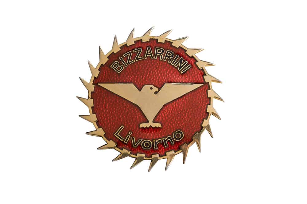
Before its demise, which came as early as 1969, the brand developed very advanced sport and racing automobiles. The logo uses a small bird as a main symbol – most likely a blue sparrow – showing off red and metallic coloring, as well.
The bird symbol sits at the center, with the outspread wings, and clear contours evoking confidence. The coloring is really a gradient of white, blue and darker shades, while the encompassing red circle displays what can only be described as golden claws creating an impressive frame.
On the edges, we can see the company’s name. The wordmark is divided into two words – ‘Bizzarrini’ and ‘Livorno’ – written using thin, golden lettering.
Simca
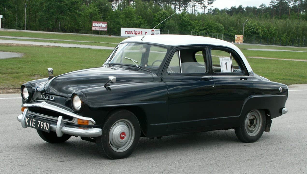
Simca – Société Industrielle de Mécanique et Carrosserie Automobile – was a French automaker founded in November 1934 and established by none other than Italian automotive giant Fiat.
Until May 1963, when the brand is ultimately absorbed into Chrysler, Simca primarily manufactured various sedan models and other passenger cars. It became a major player on the French car manufacture market and has made its way into the history books.
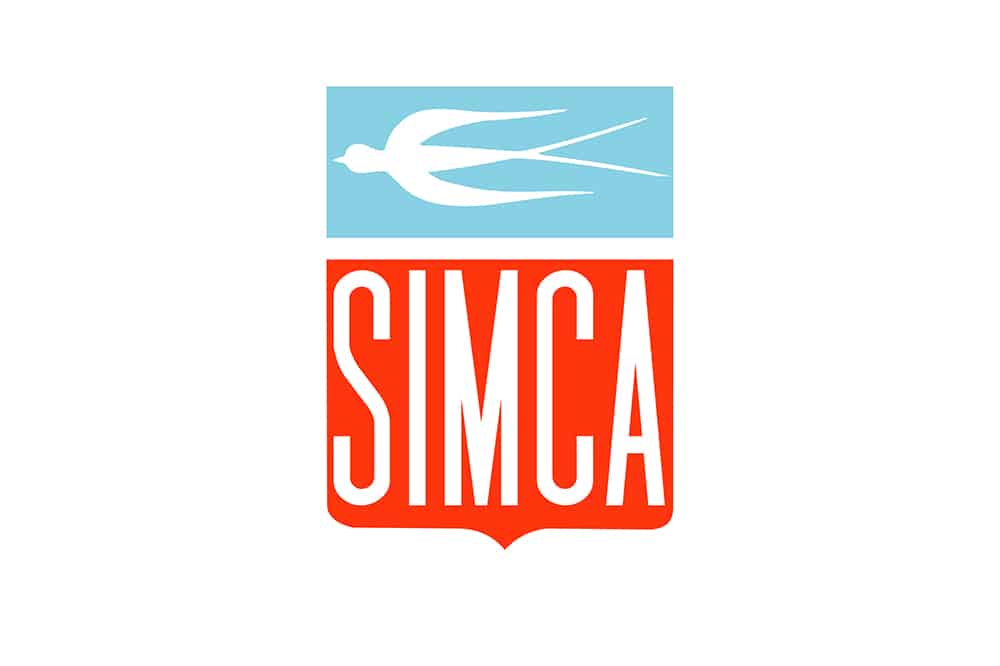
What about the brand logo? For a long time, swallows were used as the primary symbol. Synonymous with elegance throughout Europe, these birds – in the context of automotive themes – point towards versatility and functionality. It might be worth to point out that Simca vehicles were designed to be compact, brisk and agile – just like swallows.
Meanwhile, the company logo was horizontally divided. At the top, a bird in a horizontal position was on display, depicted against a blue background. The lower part of the logo is more generous, and includes the brand name written in white, light, sans-serif characters on a red background.
Arash
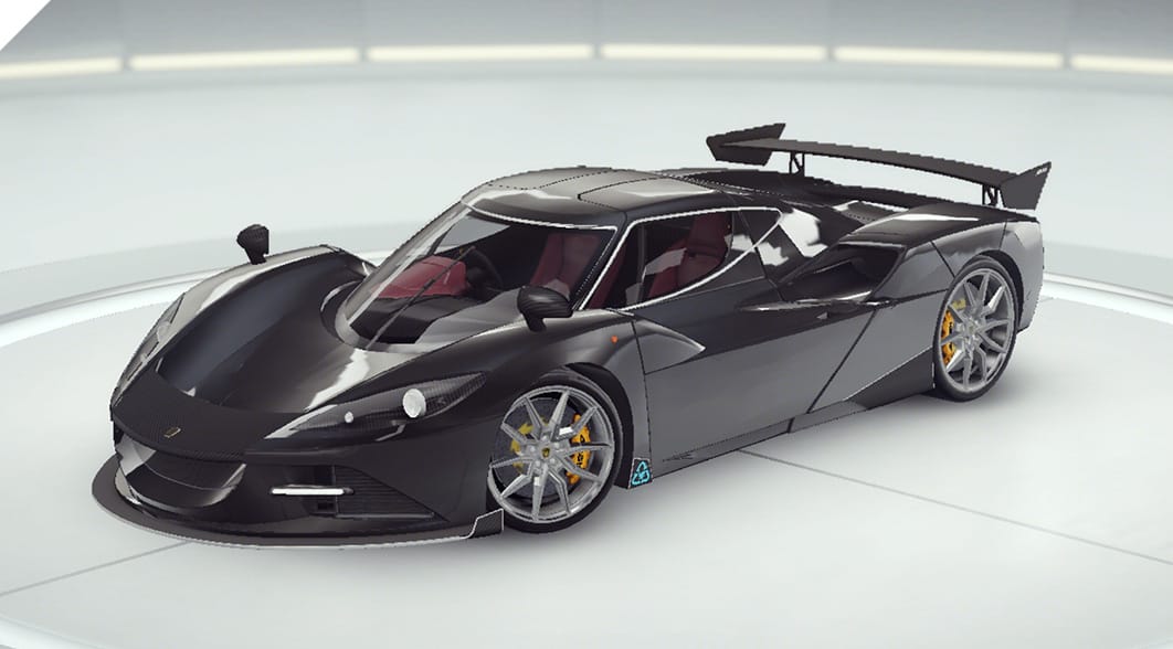
Arash Motor Company was established in Britain, back in 1999, by Arash Farboud. The brand is known for developing various sports cars , each of them unique in its own way, with two divisions responsible for very impressive designs: Arash and Farboud.
Based in Newmarket, England, the company is still very active, continuously innovating and trying to design the next best thing. Known for developing quality and very desirable cars, this British company has gained in popularity in recent years. Showing off black and yellow coloring, the company logo includes a futuristic writing of the word ‘Arash’, in sans-serif style, showing off a blend of orange and gold.
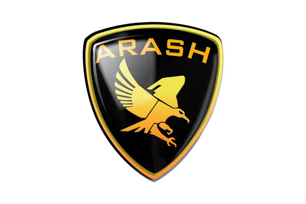
The bird comprised by the logo is a peregrine falcon, native to many places in Europe. One leg is positioned in front of the other, as if it’s ready to strike. The bird’s wings were arranged in odd positions, while it seems to be looking at us with malicious intent.
One might interpret that the Arash company logo was meant to inspire ambition, confidence, and somewhat of an automotive viciousness pointing towards fast and aggressive vehicles designed for nothing else but success.
Rossion

Rossion is an American carmaker, established in the early 2000s – at least, that’s the short version of this story. However, nothing is simple in life, and the same goes for this company. The origins of the company are found in England, where car manufacturer Noble Automotive was working its magic and developing highly appreciated sports cars.
After signing with 1G Racing to sell the Noble M12 coupe in the US, the Americans ended up selling said model under the Rossion Q1 moniker. Rossion Automotive is nowadays considered a supercar manufacturer, with each unit hand-built in Palm Beach, Florida.
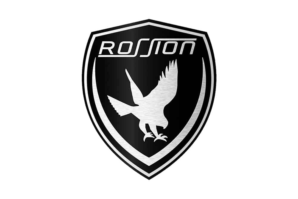
It came as no surprise to find out that the main emblem of the brand is an eagle. The focus on powerful, striking cars and the fact that the company is based on US soil seem to be explanation enough for the aforementioned decision.
The logo itself resembles a black shield, with an eagle sitting in the middle. A predator bird looks as if flying down to strike while the wings appear outstretched. The brand’s name is also present, with the sans-serif characters displaying rounded angles.
Some Rossion vehicles display a secondary logo on the steering wheels, where a bolder white name was placed onto a black rectangle. If the company was planning on inspiring reliability and their vehicles’ ability to take doen the competition, their logo design certainly fits the bill.
Conclusion
The sky’s the limit, and birds have never taken note of that. It has always been in their nature to ignore rules, such as gravity, thus inspiring humankind to evolve, dream about better things and make its own rules.
The same goes for the automotive industry, where the best engineers and designers try to bend the rules and look towards the future with no prejudice or fear. This is why we get to admire and be amazed by more and more state of the art vehicles that set new boundaries and speed records.
No one knows what will come next, but we can all agree these are some pretty exciting times to be a car enthusiasts. Maybe more car brands with car logos with birds?

